A bride once stood confused in a wedding store, comparing two gowns that looked almost the same. One was labeled white, the other ivory. Under bright lights, she noticed a soft creamy tone in one and a sharp brightness in the other. That moment revealed the real difference between white and ivory.
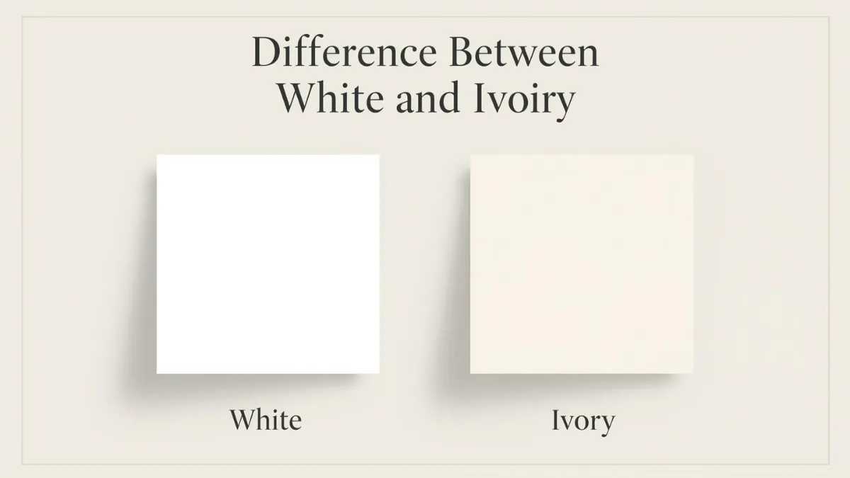
White is the purest light color, often linked with snow and paper.
Ivory is a warmer shade, inspired by the natural color of elephant tusks.
In daily life, we see this difference in paint, fashion, design, and art. Yet many people still mix them up. Understanding the difference between white and ivory helps avoid costly mistakes.
Designers, artists, and learners benefit from knowing the difference between white and ivory. Even in branding and décor, choosing the right shade matters.
So, what exactly makes them different? Let’s explore the true difference between white and ivory step by step.
Key Difference Between the Both
The main difference lies in tone and warmth.
- White is a pure, bright, and neutral color without noticeable undertones.
- Ivory has a slight yellow or creamy undertone, giving it a softer and warmer appearance.
White reflects maximum light, while ivory reflects light with a gentle warmth.
Why Is Their Difference Necessary to Know for Learners and Experts?
Understanding the difference is important in many fields:
- Fashion Industry – Wedding dresses, formal wear, and accessories often depend on precise color shades.
- Interior Design – Walls, furniture, and lighting change appearance depending on white or ivory tones.
- Art & Printing – Artists and publishers must select exact shades for visual harmony.
- Branding & Marketing – Color psychology affects customer perception.
In society, colors represent emotions and values. Choosing white instead of ivory (or vice versa) can change the entire mood of a space or message.
Pronunciation of Both (US & UK)
- White
- US: /waɪt/
- UK: /waɪt/
- Ivory
- US: /ˈaɪ.vɔːr.i/
- UK: /ˈaɪ.vər.i/
Before diving deeper, let’s break down the detailed differences in simple and clear points.
Difference Between White and Ivory
1. Tone
White is pure and bright.
Example 1: A white shirt looks crisp in sunlight.
Example 2: White paper appears clean and sharp.
Ivory has a creamy tone.
Example 1: An ivory dress looks soft in evening light.
Example 2: Ivory curtains create a cozy feel.
2. Undertone
White has no visible undertone.
Example 1: White paint reflects true light.
Example 2: White tiles look neutral.
Ivory has yellow undertones.
Example 1: Ivory walls look warmer.
Example 2: Ivory lace appears antique.
3. Warmth
White feels cool.
Example 1: White LED lights give a cold effect.
Example 2: White marble feels modern.
Ivory feels warm.
Example 1: Ivory candles feel romantic.
Example 2: Ivory sofas look inviting.
4. Brightness
White is brighter.
Example 1: Snow is bright white.
Example 2: White screens shine clearly.
Ivory is softer.
Example 1: Ivory paper reduces glare.
Example 2: Ivory paint softens rooms.
5. Formal Use
White is common in medical uniforms.
Example 1: Doctors wear white coats.
Example 2: White lab walls show cleanliness.
Ivory is common in weddings.
Example 1: Ivory gowns look elegant.
Example 2: Ivory flowers match warm themes.
6. Symbolism
White symbolizes purity and peace.
Example 1: White flags mean surrender.
Example 2: White doves represent peace.
Ivory symbolizes elegance and luxury.
Example 1: Ivory jewelry boxes look classic.
Example 2: Ivory décor feels premium.
7. Usage in Printing
White paper shows sharp contrast.
Example 1: Black ink stands out on white.
Example 2: Textbooks use white pages.
Ivory paper reduces eye strain.
Example 1: Novels often use ivory paper.
Example 2: Certificates use ivory sheets.
8. Interior Design
White makes rooms look larger.
Example 1: Small rooms painted white look bigger.
Example 2: White ceilings appear higher.
Ivory makes rooms cozy.
Example 1: Ivory walls feel softer.
Example 2: Ivory rugs add warmth.
9. Stain Visibility
White shows stains easily.
Example 1: White shirts show coffee marks.
Example 2: White shoes stain quickly.
Ivory hides minor stains better.
Example 1: Ivory fabric hides dust.
Example 2: Ivory cushions conceal marks.
10. Natural Origin
White exists naturally in light.
Example 1: Clouds appear white.
Example 2: Milk looks white.
Ivory comes from tusks and bones.
Example 1: Antique carvings were ivory.
Example 2: Old piano keys used ivory.
Nature and Behaviour of Both
White behaves as a neutral base color. It blends with all shades and enhances brightness.
Ivory behaves as a softening shade. It reduces harshness and adds warmth to surroundings.
Why Are People Confused About Their Use?
People confuse them because both appear light and similar under artificial lighting. In photos, ivory can look white. Many brands also label shades differently, increasing confusion.
Table: Difference and Similarity Between White and Ivory
| Feature | White | Ivory | Similarity |
| Tone | Pure | Creamy | Both are light colors |
| Undertone | None | Yellow | Used in fashion |
| Warmth | Cool | Warm | Popular in décor |
| Brightness | High | Medium | Symbolic meanings |
| Usage | Formal, medical | Weddings, luxury | Used in clothing |
Which Is Better in What Situation?
White is better in hospitals, laboratories, modern offices, and minimalistic designs. It reflects light strongly and creates a clean, sharp atmosphere. White works well in branding that wants to show simplicity and transparency.
Ivory is better in weddings, living rooms, classic interiors, and luxury packaging. It creates a welcoming and elegant mood. Ivory is ideal when you want softness instead of brightness.
Use in Metaphors and Similes
- “As white as snow” (very pure)
- “White lie” (harmless lie)
- “Ivory tower” (isolated academic life)
Connotative Meaning
White
- Positive: purity, peace
- Example: A white dove means harmony.
- Negative: emptiness
- Example: A white room feels lonely.
Ivory
- Positive: elegance, warmth
- Example: Ivory pearls symbolize class.
- Neutral: antique tone
- Example: Ivory pages look vintage.
Idioms or Proverbs
- White lie – A harmless lie.
- Example: She told a white lie to avoid hurting him.
- Ivory tower – Living disconnected from reality.
- Example: The professor stayed in his ivory tower.
Works in Literature
- White Fang – Novel, Jack London, 1906
- The Ivory Tower – Novel, Henry James, 1917
Movies Based on the Keywords
- White Christmas – 1954, USA
- Ivory Tower – 2014, Canada
Frequently Asked Questions
1. Is ivory darker than white?
Yes, ivory is slightly darker due to yellow undertones.
2. Can ivory look white in photos?
Yes, lighting can make ivory appear white.
3. Is white more formal than ivory?
White is traditionally more formal in uniforms.
4. Why are wedding dresses often ivory?
Ivory complements most skin tones better than bright white.
5. Can both be used together?
Yes, but careful matching is required to avoid contrast clash.
How Both Are Useful for Surroundings
White brightens spaces and increases visibility. It promotes cleanliness and simplicity.
Ivory softens the environment and creates warmth. It makes rooms feel welcoming and elegant.
Final Words for Both
White represents clarity and precision.
Ivory represents warmth and sophistication.
Both have unique importance in fashion, design, and symbolism.
Conclusion
Choosing between white and ivory may seem simple, but their impact is powerful. White is bright, pure, and modern, while ivory is warm, soft, and elegant.
Understanding the difference between white and ivory helps in fashion, art, décor, and communication. A small change in shade can completely shift mood and meaning.
If you prefer the crisp look of white or the gentle charm of ivory, both colors have special roles in society.
Know the difference. Choose wisely. Create beautifully.

I am Steven Pinker is a Canadian-American cognitive psychologist, linguist, and popular science author known for his work on language, mind, and human nature.He is the author of influential books like The Language Instinct and The Sense of Style, where he explains grammar and usage with scientific clarity.At wordrar.com, his ideas continue to inspire readers who want to understand grammar, comparison, and clear communication more deeply.